Working with our best friends, honorary sisters, and ACTUAL sisters? WHAT A DREAM.

We were tasked with rebranding our longtime friend Greer's marketing firm as she was transitioning from A Silver Lining, LLC to Carlisle + Co. She came to us with a vision for how she wanted her rebrand to pivot from their current positioning in the market and we were able to bring it to life with Kara's fun illustration style and Morgan's digital collage. With inspiration from the Carlyle Hotel NY and photos of libraries full of leather-bound books, globes, and rotary phones, we got to work.
Our goal was to bring the approachable, warm, and elegant nature of the company to the forefront while also communicating deep knowledge and experience in an industry that is chronically morphing. Using Kara's artwork, we began experimenting with layering line drawing, painted patterns, and textures to create the Carlisle "look." We chose a typeface for the logo that spoke to the art deco era but also felt modern and sleek, referencing both an established past and an evolving future.
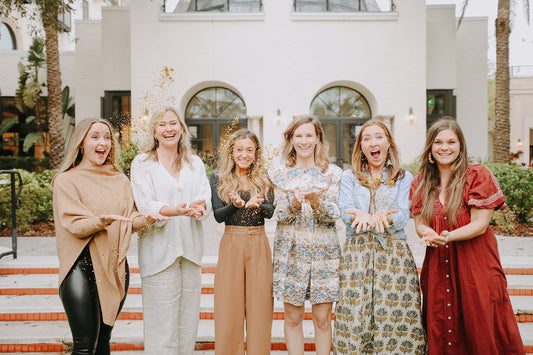
Lucky for us, our personal knowledge of the client worked in our favor and we were able to create a brand that accurately represented Greer and her amazing team (which includes Senior Project Manager Ashley, Kara's sister, and Social Media Manager Jaden, Morgan's sister). We attended the launch of the brand at the local Alfond Inn where we were also able to brainstorm ways in which our companies can work together to create solutions for the client's we share and future clients we hope to onboard down the road.
Check out the Carlisle + Co. website and all of their incredible offerings for your business!
Photos by the incredible Zoe Heafner Films.


